Migraine Down Under
Project
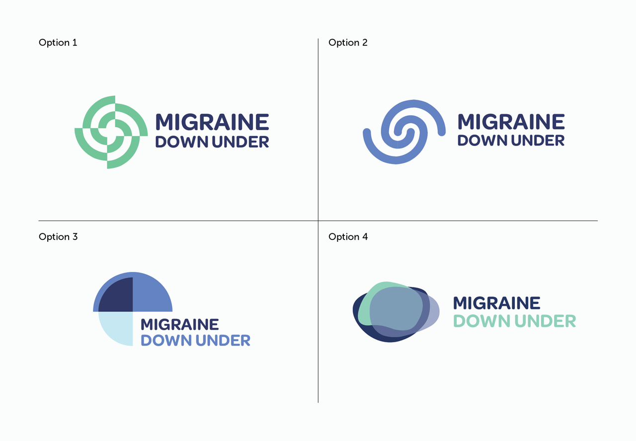
Launch of a new brand to raising awareness about migraine disease and advocating for better understanding and support in New Zealand. Sarah approached me when she was wanting to make her website more professional and the first stage was to have have a logo designed. Working with Sarah through a branding exercise we were able to form a brief and establish some key directions to explore for logo concepts.
Solution
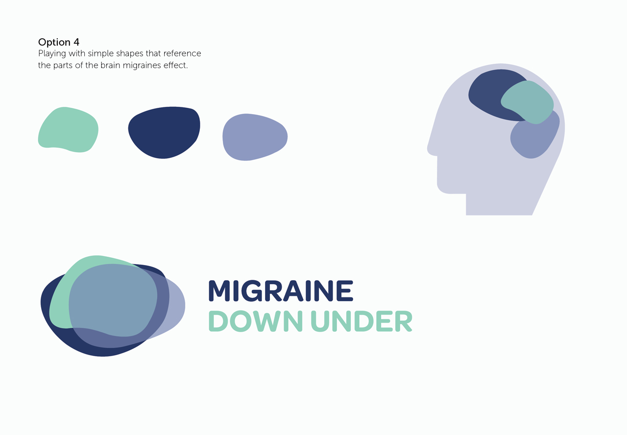
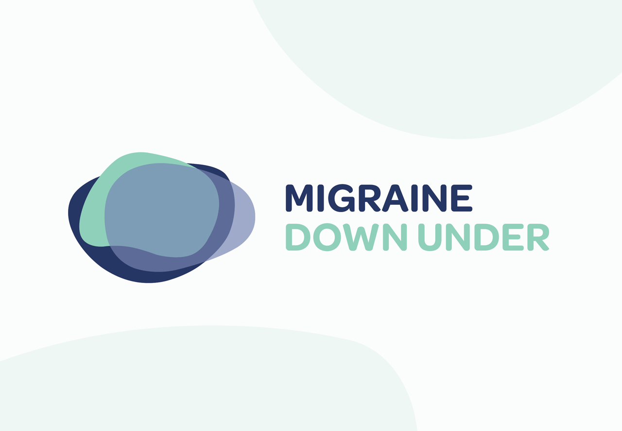
Sarah really wanted to reference the brain subtly and play on the name ‘down under’. Sarah’s website and blog is the first of it’s kind in New Zealand. The final concept came about from playing around with the different shapes parts of the brain where migraines can stem from. I then overlapped the shapes making some transparent trying to reference the idea of different solutions.
Outcome
The final logo is strong but also has a softness and friendliness. There are many opportunities to develop this logo in future to a full set of brand guidelines. The logo icon could be used as a starting direction to produce many graphics to really make the brand stronger. Use of a friendly circular san serif front really complimented the icon.
“I loved the logo concepts and final artwork created. Emma totally understood my brief and what I wanted to achieve.“
Sarah Cahill
Client
Migraine Down Under
Industry
Medical
Work Completed
Logo
