Recurve
Project
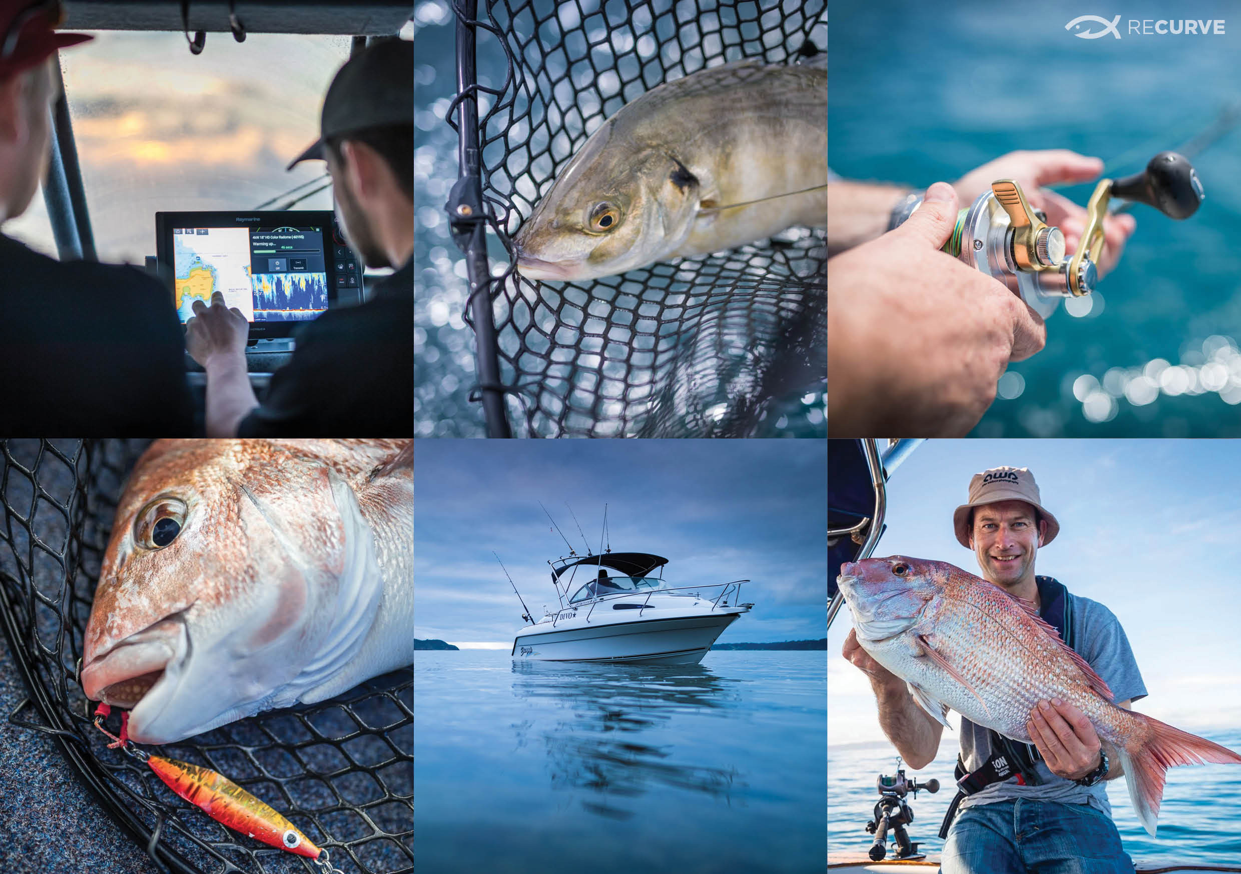
Renowned New Zealand photographer Alex Wallace started a blog and website called Recurve to post about his about his fishing and boating adventures.
Solution
Make Creative was consulted to design the logo for Recurve. After an initial branding workshop combined with extensive research Make Creative come up with 4 design directions.
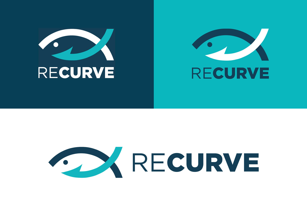
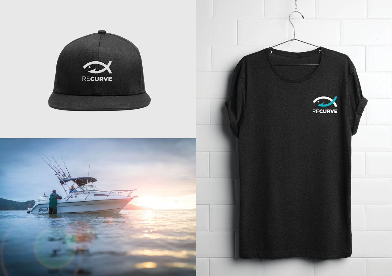
The final logo selected depicted the shape of a fish and also a hook which is a reference to the name Recurve, a type of fishing hook. I also played on the word curve by only using curved shapes for the logo. This combination mark, which comprised of a wordmark and symbol, is a great option for Alex as he can utilise the complete logo and also just the symbol for various applications such as a watermark on his photos. The logo uses minimal solid curved lines so that the logo can easily be reproduced onto t-shirts and hoodies. The font selected was a fresh masculine geometric san serif.
Outcome
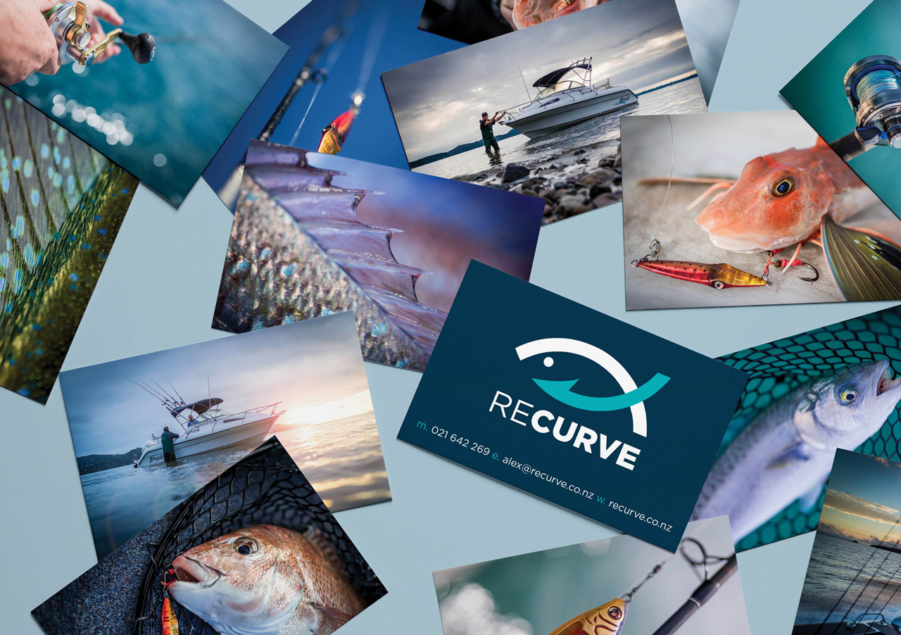
Alex was extremely happy with the logo and how easily it worked on his website and also on promotional material such as t-shirts, caps and as a watermark on photos.
“The Recurve brand had been percolating in my mind for a long time. I came to Emma with a mish-mash of style guides as a steer toward how I hoped my logo should eventually look. Drawing upon these for inspiration, she distilled them down into a simple, elegant and effective design – and I couldn’t be any happier with the result!” Alex Wallace, owner of Alex Wallace Photography and Recurve.
Client
Recurve
Industry
Fishing and Boating
Work Completed
Logo Design
Marketing